Visualizing Correlation Vector Math
In this post I'll share some visualizations I made while taking Dan Boschen's DSP for Wireless Communications course and shared with the rest of the class.
I modified Dan's example code to create Pikchr animations to gain a better intuitive understanding of an very important concept in DSP: correlation.
I highly recommend his courses for anyone interested in learning more about digital signal processing fundamentals and/or refreshing their skills. I was exposed to some DSP in college but never took a proper DSP class, and it always helps to fill in gaps in the rest of my self-taught knowledge. His courses are a fantastic deal, in my opinion.
Correlation
One point Dan emphasizes is the importance of correlation as a foundation of many signal processing tasks, such as the Fourier and Laplace transforms, FIR filters, CDMA, etc.1
In discrete time,2 a correlation has this form: \[\sum f[n]g^{\ast}[n]\]
In this abstract form, it isn't immediately obvious what this is useful for, or why the complex conjugate of \(g[n]\) is used.
In short, \(f[n]\) represents a complex valued input signal sampled at regular intervals, and \(g[n]\) represents some complex waveform we might expect to see in the signal. If the expected waveform is present, then the correlation will sum to a larger magnitude than if the waveform is not present. The correlation provides a measure how similar the two signals are. A stronger presence will have a larger correlation magnitude than a weaker one.
A frequent and very useful "test signal" to compare an input against is a unit-magnitude complex sinusoid, \(e^{j\omega t}\). This is the core of the Fourier transform and it's variants.3
If \(f[n]\) and \(g[n]\) are in phase with each other then multiplying \(f[n]\) by the conjugate \(g^{\ast}[n]\) causes the phase to cancel and the resulting vector will land on the positive real axis (zero phase).4 Summing a bunch of vectors on the positive real axis results in a longer vector on the real axis and thus a larger magnitude. As we'll see in the visualizations of this vector math, signals that do not match in frequency sum to smaller magnitudes.
Visualizations
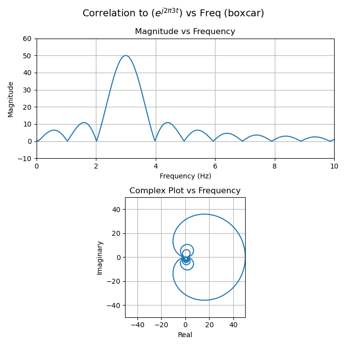
In the following examples, the input signal \(f\) is a 3 Hz sine wave, but let's pretend we don't know that yet. How would we know what frequency or frequencies are present in the input? By evaluating multiple correlations while sweeping the test frequency.
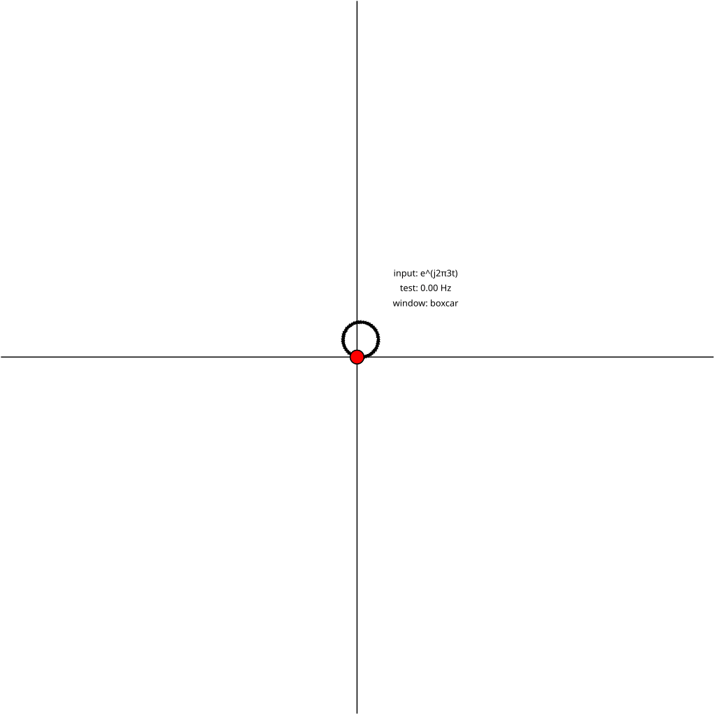
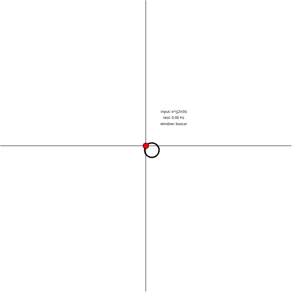
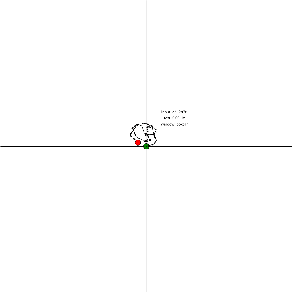
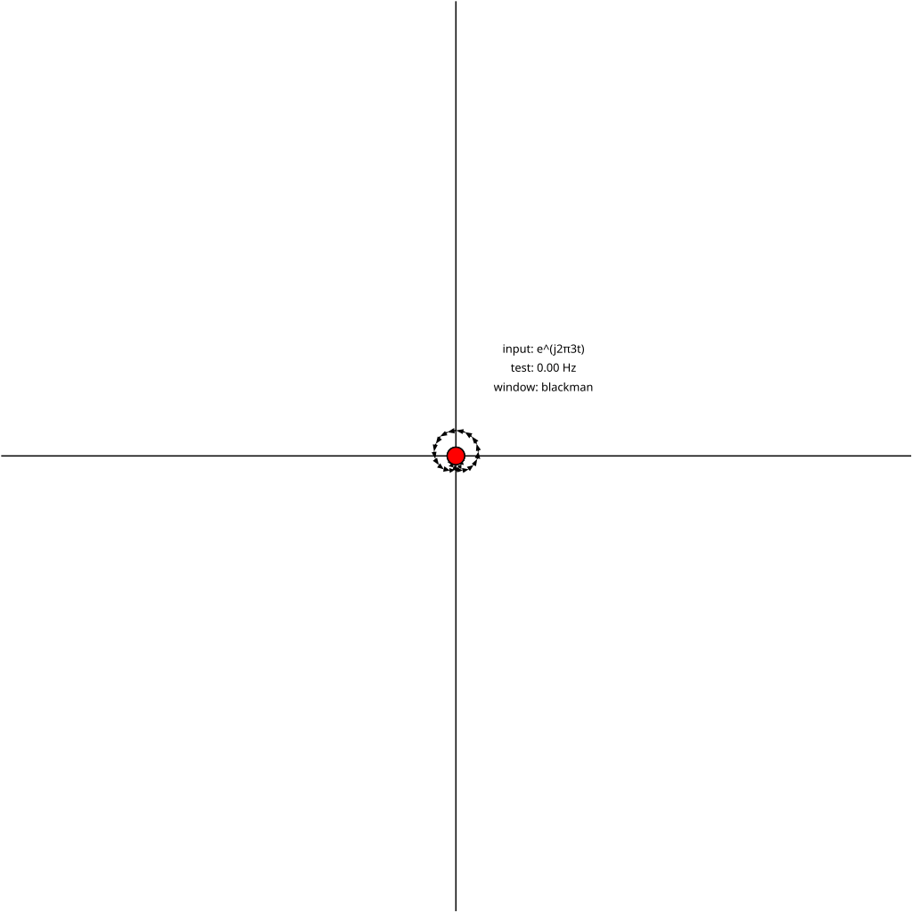
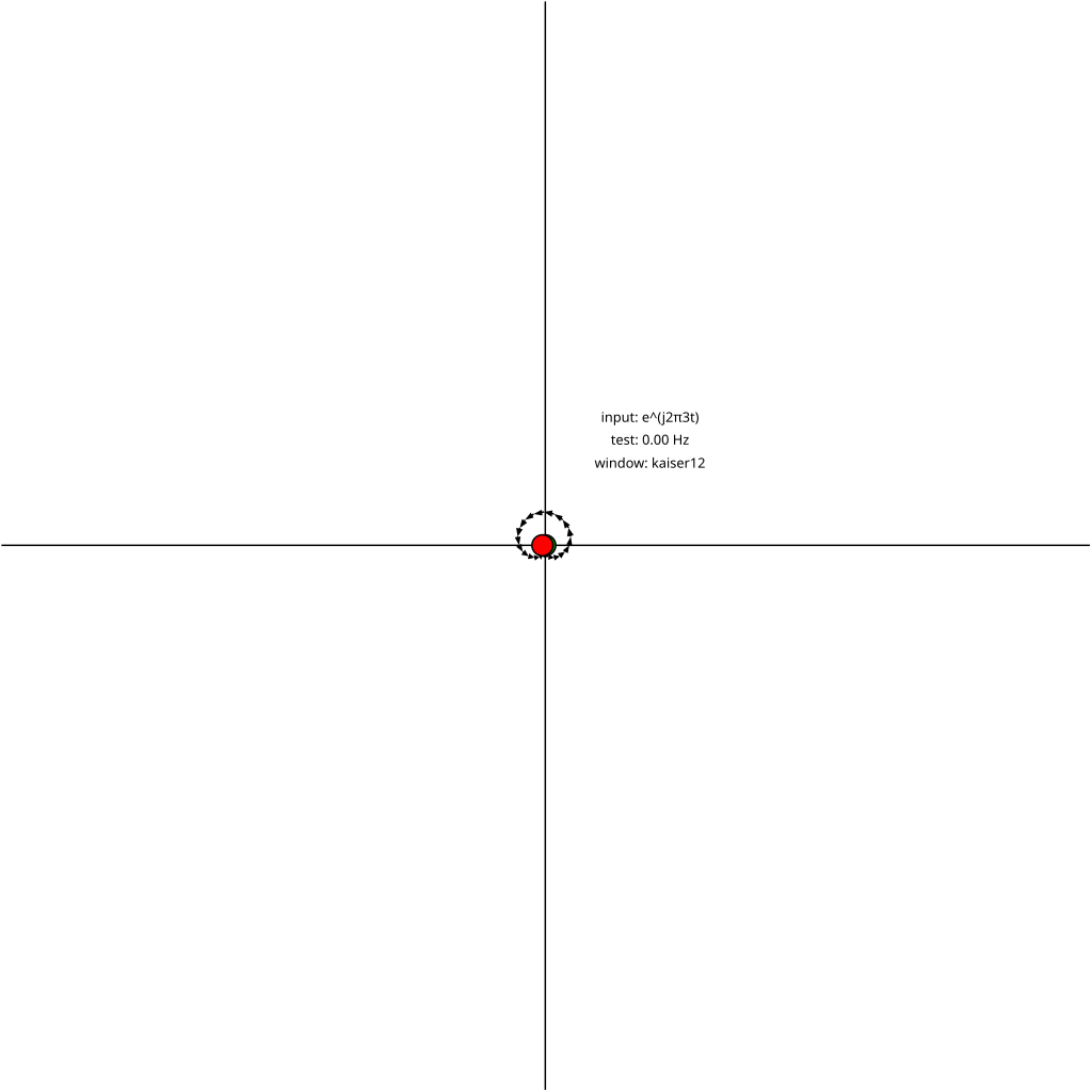
That's what's shown in the following animation. The input signal is the same in every frame (3 Hz sine wave), but the test signal is swept from 0 Hz to 4 Hz. The animations correlate 50 samples of the input and test signal.
The green dot is \(0+0j\), the origin of the complex plane, the start of the vector sum. Each vector \(f[1]g^{\ast}[1], f[2]g^{\ast}[2],\dots, f[N]g^{\ast}[N]\) is added, and the final sum is marked by the red dot. The distance from the origin to the red dot is the magnitude of the sum, and the angle from the positive real axis gives the phase.
A few things to notice:
- The sum passes through the origin multiple times. These form the nulls in the sinc-like response seen in magnitude plots below.5
- The partial sums of the vectors (in other words, each arrow head) lie on a circle. (When the test and input frequencies exactly match, the straight line is like a circle with infinite radius).
- The angle between each neighboring vector in the sum increases as the test frequency deviates from the input frequency, and is zero when they match.
- This makes it more clear why the peaks in the sinc response get smaller farther from the signal frequency: as the same number of vectors wrap around more and more complete circles the circumference must shrink, and therefore the maximum magnitude of more distant lobes decreases. (I first imagined a boa constrictor and Dan likened it to a coiling spring which is more accurate.)
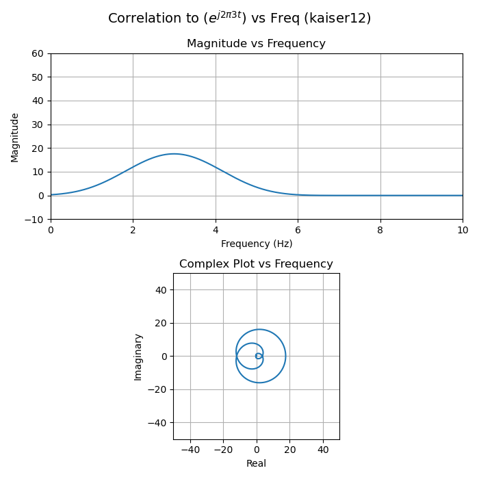
- The locus of points traced by the red dot are the same as the complex plot below (from 0 Hz to 4 Hz).
- Test signals that are near the input signal in frequency still sum to long vectors. This is known as "spectral leakage". Summing more vectors would allow the final sum to travel further around the circle traced by the partial sums and land farther away from the positive real axis, resulting in a smaller sum magnitude and thus better frequency resolution.
Phase offset
When the input signal and test signals have the same frequency but have a phase offset, then the vectors will not land on the positive real axis, but along another line. For example, here the test signal leads the input signal by 2 radians:
Noise
For fun and completeness, here's an example with noise added:
This Stack Exchange post by Dan describes how noise grows more slowly than signal during a correlation (a very useful effect known as "processing gain"):
Derivation of the Optimal Matched Filter - Convolution vs. Correlation
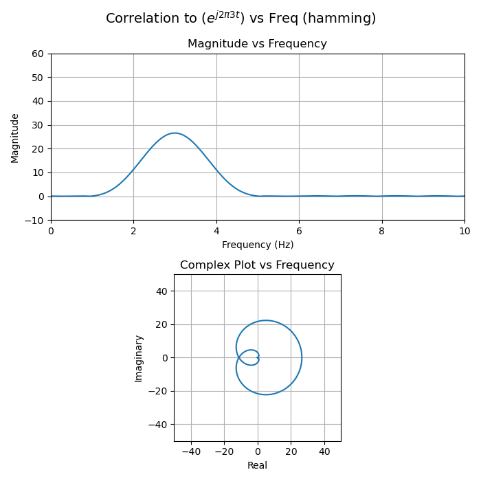
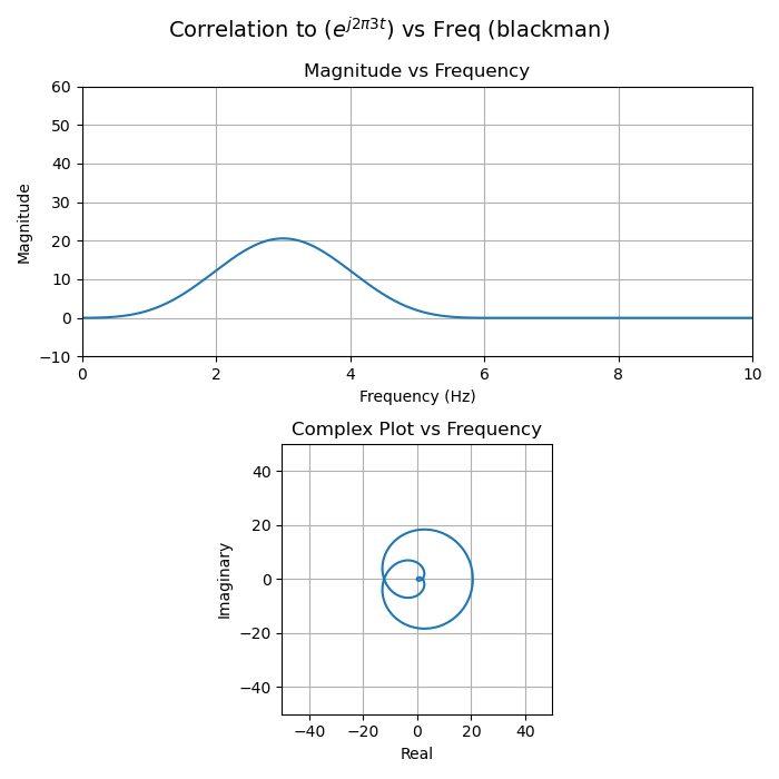
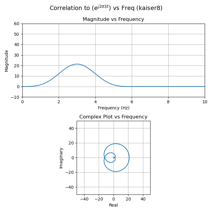
Windowing
Things get a less visually interesting when windowing. Windowing is a technique to reduce the amplitude of sidelobes in the correlation magnitude. It consists of multiplying the input sequence (or test sequence) by a real function that tapers off to zero.6
Using no window function is the same as using a rectangular pulse of unity magnitude, a function that resembles a "boxcar" on a train, hence the name "boxcar window".
A few things to notice about the following plots:
- The partial sums (each arrow head) no longer trace a perfect circle.
- The magnitude when the input and test signals perfectly match is decreased compared to the boxcar (no windowing) case. In other words, the main lobe is smaller. This is called the "coherent gain" of the window function and will always be negative. This makes intuitive sense, because the window functions shrink many of the vectors, so their total sum must go down.
- The final sums still pass through the origin when there's a large frequency mismatch, but the magnitude of the side lobes is much smaller. It's hard to see linear scale plots, but easier to see in logarithmically scaled plots. Reducing the side lobes is the primary reason for windowing.
Hamming

Blackman
Kaiser (\(\beta=8\))

Kaiser (\(\beta=12\))
The code
This is the Python code to generate Pikchr drawings and magnitude plots for each correlation (corr_viz.py):
#!/usr/bin/env python3

# Generate visualizations for correlation dot products.
#
# Copyright © 2018-2024 C. Daniel Boschen
# Copyright © 2025 Remington Furman
#
# SPDX-License-Identifier: MIT
#
# Permission is hereby granted, free of charge, to any person
# obtaining a copy of the software demonstrated in code cells (the
# "Software"), to deal in the Software without restriction, including
# without limitation the rights to use, copy, modify, merge, publish,
# distribute, sublicense, and/or sell copies of the Software, and to
# permit persons to whom the Software is furnished to do so, subject
# to the following conditions:
#
# The above copyright notice and this permission notice shall be
# included in all copies or substantial portions of the Software.
#
# THE SOFTWARE IS PROVIDED "AS IS", WITHOUT WARRANTY OF ANY KIND,
# EXPRESS OR IMPLIED, INCLUDING BUT NOT LIMITED TO THE WARRANTIES OF
# MERCHANTABILITY, FITNESS FOR A PARTICULAR PURPOSE AND
# NONINFRINGEMENT. IN NO EVENT SHALL THE AUTHORS OR COPYRIGHT HOLDERS
# BE LIABLE FOR ANY CLAIM, DAMAGES OR OTHER LIABILITY, WHETHER IN AN
# ACTION OF CONTRACT, TORT OR OTHERWISE, ARISING FROM, OUT OF OR IN
# CONNECTION WITH THE SOFTWARE OR THE USE OR OTHER DEALINGS IN THE
# SOFTWARE.

import numpy as np
from numpy.random import randn
import scipy.signal as sig
import matplotlib.pyplot as plt

# Length of the correlation.
N = 50

# Time axis, signal is 1 second, sampled at 1 KSps.
t = np.linspace(0,1,N, endpoint = N)

# Modify this to add noise.
noise_mag = 0.0

# Modify this to add a phase offset.
phase_offset_rad = 0.0

# Input signal.
f = np.exp(1j*2*np.pi*3*t)
f = f + (noise_mag*randn(N) + noise_mag*1j*randn(N))/np.sqrt(2)

def mancorr(a,b):
    # Use shorter length if not same size.
    minsize = min(len(a),len(b))
    corr = np.dot(a[:minsize], np.conj(b[:minsize]))
    # Scale by length.
    return corr

def corr_vectors_pikchr(f,g,g_Hz,name):
    scale=10
    viewbox=(N+2)/scale
    out=""
    out+=f"line from (0,{-viewbox}) to (0,{viewbox})\n"
    out+=f"line from ({-viewbox},0) to ({viewbox},0)\n"
    out+="circlerad=0.1\n"
    out+="circle fill green at (0,0)\n"
    out+="dot invisible at last circle.c\n"
    for u,v in list(zip(f,g))[:-1]:
        prod = u*np.conj(v) / scale
        out+=f"arrow right {np.real(prod):0.4f} up {np.imag(prod):0.4f}\n"
    out+="circle fill red with .c at last arrow.end\n"

    out+=f'text "input: e^(j2π3t)" big big '
    out+=f'"test: {g_Hz:.2f} Hz" big big '
    out+=f'"window: {name}" big big at (1,1)\n'
    return out

def corr_visualization(name, window):
    f_windowed = f*window
    for g_Hz in np.arange(0.0, 10.01, 0.1):
        with open(f'{name}_{g_Hz:.2f}_Hz.pikchr', 'w') as file:
            # Correlate to g_Hz
            g = np.exp(1j*2*np.pi*g_Hz*t + 1j*phase_offset_rad)
            corr = mancorr(f_windowed, g)
            file.write(corr_vectors_pikchr(f_windowed,g,g_Hz,name))

def corr_plot(name, window):
    f_windowed = f*window

    # Sweep frequency from 0 to 10 Hz, 1000 samples.
    freqs = np.linspace(0, 10, 1000)
    corrs = [mancorr(f_windowed,
                     np.exp(1j*2*np.pi*f*t + 1j*phase_offset_rad))
             for f in freqs]

    plt.figure(figsize=(7,7))
    plt.subplot(2,1,1)
    plt.plot(freqs, np.abs(corrs))
    plt.title("Magnitude vs Frequency")
    plt.xlabel("Frequency (Hz)")
    plt.ylabel("Magnitude")
    plt.grid()
    ax = [0, 10, -10, N*1.2]
    plt.axis(ax)

    plt.subplot(2,1,2)
    plt.axis('square')
    plt.axis([-N,N,-N,N])
    plt.plot(np.real(corrs), np.imag(corrs))
    plt.title("Complex Plot vs Frequency")
    plt.xlabel("Real")
    plt.ylabel("Imaginary")
    plt.grid()
    plt.suptitle(r"Correlation to ($e^{j2\pi3t}$) vs Freq" + f" ({name})", fontsize=14)
    plt.tight_layout();
    plt.savefig(f'corr_plots_{name}.png')
    plt.close()

windows = {
    "boxcar": sig.windows.boxcar(N),
    "hamming": sig.windows.hamming(N),
    "blackman": sig.windows.blackman(N),
    "kaiser8": sig.windows.kaiser(N, 8),
    "kaiser12": sig.windows.kaiser(N, 12),
}

for window in windows:
    print(window)
    corr_visualization(window, windows[window])
    corr_plot(window, windows[window])

print("done")
It's easy to play with noise and phase offsets in the above code.
This Makefile creates the animated gifs from the Pikchr output (Makefile):
MAKEFLAGS += --no-builtin-rules
MAKEFLAGS += --no-builtin-variables

SRCS=$(shell ls *.pikchr | sort -t_ -k2 -n)
SVGS=$(SRCS:.pikchr=.svg)
PNGS=$(SRCS:.pikchr=.png)

svgs: $(SVGS)
pngs: $(PNGS)

%.svg: %.pikchr
        pikchr --svg-only $< > $@

%.png: %.svg
        inkscape -w 1024 -h 1024 -y 1.0 -b "#ffffff" $< -o $@

windows=boxcar hamming blackman kaiser8 kaiser12
GIFS=$(windows:%=%.gif)
gifs: $(GIFS)

define GIF_rule
$(1): $(filter $(1:%.gif=%)%, $(PNGS))
        magick -delay 20 -loop 0 $$^ $$@
endef

# Automatically create targets for each window GIF.
$(foreach gif, $(GIFS), $(eval $(call GIF_rule, $(gif))))
For reference, the code runs with the Python libraries in this requirements.txt file.
Footnotes:
Another point Dan emphasizes is that working with complex phasor notation simplifies much of the math and concepts of signal processing, compared to thinking in terms of individual sine and cosine waveforms.
In continuous time, correlation is: \[\int f(x) g^{\ast}(x)dx\]
I focus on the discrete time case in this post, since that is what digital signal processing works with and it's what I have visualizations for.
The first book that make the Fourier transform click for me is
the fantastic Musimathics, Vol II. I was already somewhat familiar
with correlation from college when I read it, but had not realized
that was what the Fourier transform equations were doing.
For more background, Dan is a frequent contributor to the Signal
Processing Stack Exchange. His post here summarizes how
correlation is used in the Fourier transform:
Qualitative Explanation of Fourier Transform
And thanks to Dan for suggesting some improvements to the first
version of this article, including the terminology in this paragraph.
Some complex math review, for reference.
In rectangular form: \[z \cdot z^{\ast}=(a+jb)(a-jb)=a^2+b^2\]
In polar form magnitudes multiply and phases add:
\[z \cdot z^{\ast}=re^{\phi j}re^{-\phi j}=r^2e^0=r^2\]
The shape of the magnitude plot is like the sinc function (\(sin(x)/x\)), but slightly different because we're performing the DTFT (Discrete Time Fourier Transform) here and that results in frequency aliasing. The name for this function is the "Dirichlet kernel".
It doesn't matter whether you window the input signal or the test signal, since multiplication is associative and commutative. The result will be the same. Performance-wise, it's better to window the input signal once instead of windowing each test signal when sweeping.